Affordance
Designing of things should be done such that it is clear what it is for. A button is for pressing and a knob for turning.
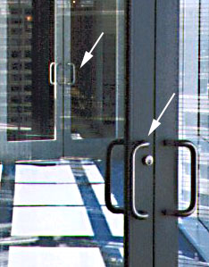 What about this door here? Handles like this are designed for pulling. There is nothing unintuitive here for the door in the front. You can pull open the door and proceed down to the next door. You pull that door and what happens? The door cannot be opened! It turns out that the back door must be pushed, even though it looks similar to the one in front. In fact, many people got trapped in the walkway as a result.
What can be done to remedy this situation? It should be obvious both doors should be pulled. Alternately, a 'Pull' or 'Push' label can be displayed on the door, which i believe to be rather commonplace nowadays.
Consistency
This does not refer to just the colour schemes, but can also refer to placement of buttons and so on. This is one product that is inconsistent.
 This is a kitchen timer. It should be easy to see how it works. Want to leave your favourite food to simmer while you watch television for 30 minutes? Turn it clockwise to 30. Now how about if you wanted to wait for 15 minutes? If you turn clockwise to 15, you are wrong. This is where the trouble starts. To set a timer of less than 15 minutes, you will need to turn one full round, then to 15. This clearly shows a lack of consistency in design.
Feedback
Feedback is incredibly important. We need to know the state of the system. We need to know the impact of what we have done. Is the application processed? Did the system received my application? The following is an example with bad feedback.
 This is a coffee maker. On the menu are 4 buttons, which is nicely designed and clear what pressing them will do. But the problem starts after you press the button. The top red light is fairly clear in the message it gives. Lit means 'On'. Otherwise, 'Off'. The orange light, however, lights up when you press the lower right button - for 3 or less cups. The orange light is off if you select more than 3 cups. Generally, we would expect the light to go on when we select more, and off when we select off. The feedback given here is exactly the opposite.
And these are just 3 simple examples of bad designs. These examples are taken from http://www.baddesigns.com/, which has many more of them. We can certainly learn what not to do as we look at such examples.
It will be interesting how you can link such real life inconsistency to HCI design and how you can improve it. For example, the handle for opening a door.
ReplyDelete